Properties Pane
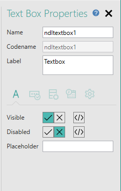
The Properties Pane is located on the right-hand side of the Form Studio window:

'Properties' are options or settings which allow you to influence the look and functionality of individual items within your form. Items such as the form itself, pages, data entry items (text boxes, check boxes etc.) and the Datasources, which define the data you will be collecting and displaying in your form, all have various Properties which you can configure to suit the requirements of your form. The Properties Pane is used to display properties for an item so that you can check what properties are available for that item, see the current settings and change the settings if you need or want to.
You can display the properties for most items by selecting the item within the Form Design workspace or within the Project Explorer. More information about how to display properties will be found in other
At the top of the Properties Pane you will see a title, telling you which properties are displayed in the pane.
To the right of this you will see the  icon. Data entry items, such as text boxes, check boxes, drop-down lists etc., within Form Studio are called Elements and each of the Elements available to add to your form has a version number. When displaying the properties for an Element in the Properties Pane, you can display the version number of the Element by hovering your mouse pointer over this icon.
Below these items you will see the properties for the currently selected item.
At the top of the properties, you will see a Name property, used to identify the item, and maybe one or two other properties. Below these are a set of tabs:

dividing the remaining properties into the following categories:
 Appearance - contains commonly used properties, which affect the appearance of the item,
 Rules - allows you to set up validation criteria, which will be used at runtime to make sure users complete your form correctly,
 Data - allows you to link data entry items on your form to columns in database tables,
 Events - allows you to assign actions when things happen within the form, e.g. when a page loads, a button is clicked or a value is entered into a text box,
 Advanced - properties which influence behaviour and other aspects of the item, including applying styles.
The properties vary for each item and not all items have properties in each category. If a category has no properties, the corresponding tab isn't displayed for that item. You can see which tab is which by holding your mouse pointer over a tab's icon to display a tooltip showing the category covered by the tab. To display the properties within a category, click on the tab.
The Name property is always displayed irrespective of the currently selected tab, as a reminder of which item's properties you are looking at. There may also be other properties displayed above the tabs with the Name property, e.g. all Elements, forms, pages, Datasources, Datasets and Dataset columns have a Code Name property which will be displayed here - this property will be relevant if you need to customise your form using JavaScript.
Within the Properties Pane, the properties take various forms.
Some properties take the form of edit boxes, check boxes and drop-down lists. These operate in the standard Windows manner. Where a property has an edit box for the value, you can use standard Cut, Copy, Paste and Delete facilities. You can select text with your mouse, use the Del or Backspace keys to delete text, right-click in the field to access Cut, Copy, Paste and Delete options from a menu or use Ctrl+X, Ctrl+C and Ctrl+P to cut, copy and paste, respectively. If the property allows you to type in a value, there may be a limit to the number of characters you can enter. When the maximum number of characters is reached, any additional characters you type will be ignored.
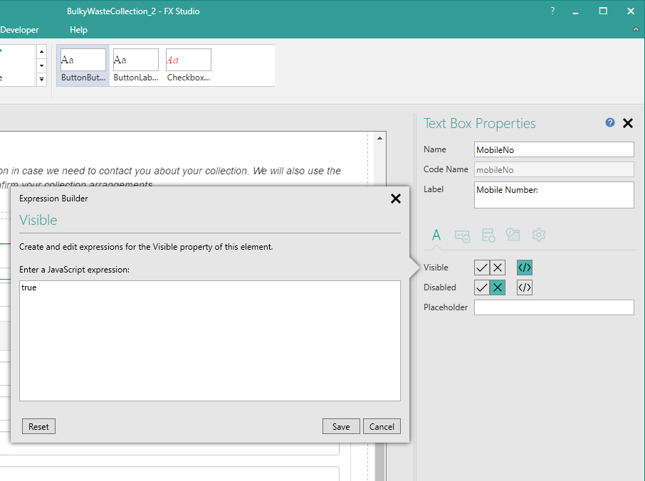
Other properties are more complex and may display a pop-up dialog allowing you to enter the required information, e.g.:

To display the pop-up you need to click on the relevant part of the property - there is normally a button within the property to do this. Properties which display pop-ups are discussed at appropriate points under other relevant
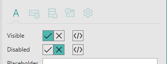
In the pop-up image above note the Visible and Disabled properties:

This type of property has two parts. The  boxes allow you to directly set the property to on (true) or off (false), by selecting the appropriate box;
  for on and
  for off. The Disabled property in the above image has the
  selected, setting the property to off, i.e. the Element will not be disabled, which means it is enabled and therefore will be accessible to the user of the form. The Visible property, on the other hand has the third box selected:
  . Selecting this box will display the pop-up shown earlier, which allows you to enter your own custom JavaScript expression to be used to determine whether the Element should be visible or hidden at runtime.
Right-clicking on a property in the Properties Pane will display a context-sensitive menu. Apart from the standard Cut, Copy, Paste and Delete options mentioned earlier, this menu may also provide the following options:
-
Clear value
Delete the currently set value and leave the property blank.
-
Reset to default
Reset the property to its default shipping value.
Note that with some properties you may get different items appearing on the menu depending upon where on the property you click. For example, with a drop-down list property, you will need to click on the down arrow at the right-hand end of the property to obtain the Clear value and Reset to default options.
If you select multiple Elements on a form, the Properties Pane will not display any properties.
You can close the Properties Pane by clicking on the  in the top right-hand corner of the Pane or by choosing Show Properties from the Ribbon's View tab. To redisplay the Pane, choose Show Properties from the Ribbon's View tab.
